React MVVM Architecture with TanStack Router: View Layer

A clear separation between UI and business logic is absolutely crucial. It makes testing and maintaining your React components much easier. This is something I scrambled with a lot in the past. I would even avoid writing unit tests, because it was so hard to mock everything in some enormous component that included JSX, hooks, data fetching, etc., all in one.
That’s why I started delving into the clean architecture in React. After years of research, trial and error, I finally found the approach that helps me to keep my components simple, yet rich in UI and features.
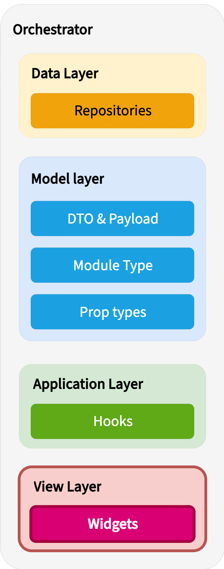
Today, we’re talking about the view layer of this five-layer MVVM implementation:
In this article, you’ll learn:
How and where to keep the layout for the whole app in TanStack Router.
How and why keep your components clean.
How easy it is to test clean React components.
Before we begin, I want to remind, that in this MVVM series, we’re building a country quiz app. The app prompts the user with the flag, and the user has to guess the country. Once they entered and sent the answer, we save it in localStorage. Then we display the answer history in the left sidebar. You can find the source code on GitHub and the Demo on CodeSandbox.
Shape of the whole app
TanStack Router recommends utilizing its file-based routing system. That’s why when we bootstrapped our app in the data layer article, we got the routes folder with two files:
__root.tsx- wrapper for all routes in our app.index.tsx- main route in our app. It stands for the/path.
At the moment, let’s focus our attention on __root.tsx , because that’s where we’ll keep the layout of the app:
import { Grid } from "@mui/material";
import { Outlet, createRootRoute } from "@tanstack/react-router";

export const Route = createRootRoute({
  component: () => (
    <Grid container sx={{ height: "100vh" }}>
      <Grid
        size={3}
        sx={{
          height: "100%",
          backgroundColor: "ButtonShadow",
          overflowY: "scroll",
        }}
      >
        {/* Put here the history list once it's implemented */}
      </Grid>
      <Grid size={9}>
        <Outlet />
      </Grid>
    </Grid>
  ),
});
Let’s break it down:
First, we create a root route. The official documentation explains it: “The
createRootRoutefunction returns a new root route instance”. The difference between the root route and the index route is that the root route doesn’t have the path, like the index route does (/path). Root route is used to create a route tree and store the layout of the app.Second, we define a structure of the layout using
Gridcomponent. This component comes from the MUI library. Using it is an optional step. You can choose a different components library or skip any libraries entirely. I’ll continue utilizing MUI in all the next tutorials, because it’s just easier and quicker to develop UI with its wide range of components.With the
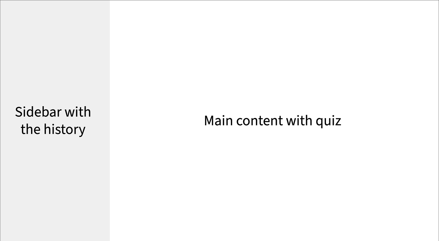
Gridcomponent, we defined the next layout:Humble, but more than enough for our simple app.
The final touch is the Outlet component, which is provided by TanStack Router. The
Outletrenders the next potentially matching child route. If the user has entered/in the browser’s search bar, theOutletwill render the UI matching the/path.
Good, we have the layout. Let’s fill it with the content now.
Let the users guess the country
Now that we’ve defined the layout, it’s time to focus on the Quiz widget that the user interacts with:
// src/modules/Home/view/Quiz.tsx

import {
  Button,
  Card,
  CardActions,
  CardContent,
  CardMedia,
} from "@mui/material";
import type { QuizProps } from "../model";
import { QuizForm } from "./QuizForm";
import { QuizResult } from "./QuizResult";

export const Quiz: React.FC<QuizProps> = ({
  country,
  form,
  result,
  onSubmit,
}) => {
  return (
    <Card sx={{ width: 320, margin: "0 auto" }}>
      <CardMedia
        sx={{ height: 198 }}
        image={country.flag}
        title="Country flag"
      />
      <CardContent sx={(theme) => ({ padding: theme.spacing(2, 1) })}>
        {!result ? <QuizForm form={form} /> : <QuizResult result={result} />}
      </CardContent>
      <CardActions sx={{ display: "flex", justifyContent: "end" }}>
        <Button size="small" variant="contained" onClick={onSubmit}>
          {!result ? "Submit answer" : "Next country"}
        </Button>
      </CardActions>
    </Card>
  );
};
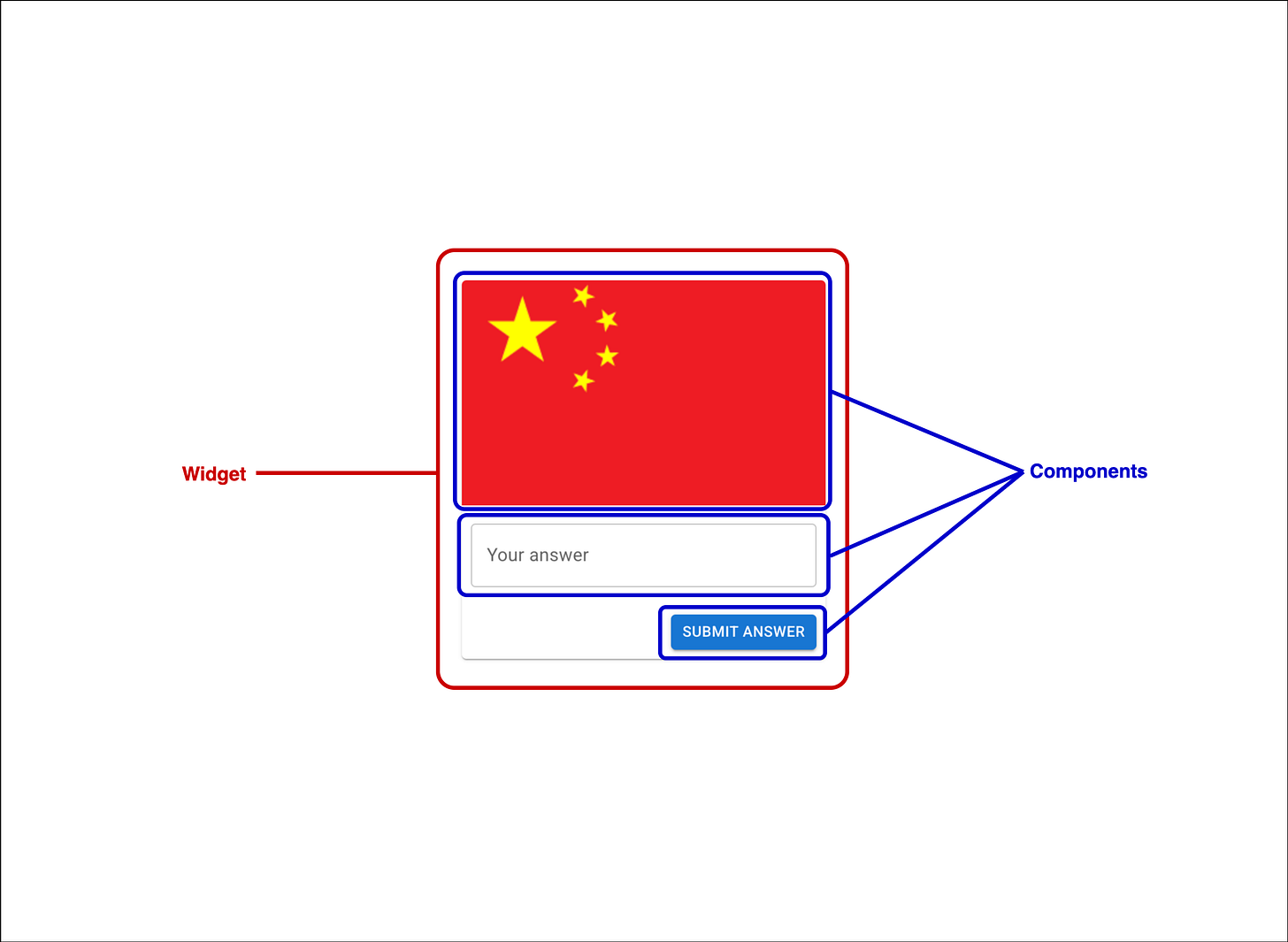
NOTE: What’s the widget? - It is an individual component that renders the UI and responds to events. Why do I call it a widget? - It’s a Flutter-inspired name to call a React component, which already combines a couple of other smaller components. For example, the
Quizwidget blendsCard,Button,CardContent, and so on:
Let’s break the Quiz widget step by step, just like we did with the layout:
We start by creating a functional React component typed with
QuizProps, which accepts the following props:country - the object of randomly selected country to guess.
form - TanStack Form’s instance. TanStack Form is a headless form state manager. It includes submission, validation, composition, and other great staff. We touch on some UI aspects of the library later in this article. We also discuss form handling in the application layer article.
Feel free to use any form management library if you’re not comfy with TanStack Form.
result - the result of the user’s attempt to guess the country.
onSubmit - a function that’s called when the user clicks the action button. It either submits the answer or triggers loading the next country, if the result is already shown.
For now,
QuizPropscan look like this:// src/modules/Home/model/home.props.ts import type { CreateHistoryRecordDTO } from "@/modules/History/model"; export type QuizProps = { country: any; form: any; result?: CreateHistoryRecordDTO; onSubmit: VoidFunction; };We’ll fix it when we develop the hook to handle quiz logic and apply the trick.
I use Card MUI’s component and its pieces to create an actual UI.
Pay attention to this line:
{!result ? <QuizForm form={form} /> : <QuizResult result={result} />}Here we have 2 additional components:
QuizFormandQuizResult. I created them because of 2 reasons:Make
Quizwidget smaller, by moving UI with different responsibilities to different widgets.Fulfill the Single Responsibility principle of SOLID.
Let’s take a look at each widget. 👇
Answering form
Since the form is what the user sees first, let’s begin with QuizForm, the input widget responsible for capturing the answer:
// src/modules/Home/view/QuizForm.tsx

import { TextField } from "@mui/material";
import type { QuizFormProps } from "../model";

export const QuizForm: React.FC<QuizFormProps> = ({ form }) => {
  return (
    <form>
      <form.Field name="answer">
        {(field) => (
          <TextField
            label="Your answer"
            variant="outlined"
            sx={{ width: "100%" }}
            error={!field.state.meta.isValid}
            helperText={field.state.meta.errors[0]}
            value={field.state.value}
            onChange={(event) => field.handleChange(event.target.value)}
          />
        )}
      </form.Field>
    </form>
  );
};
Again, it’s a stateless, logic-free functional component which expects to receive 1 property: form. This form instance is the same one passed into the Quiz widget, so the QuizFormProps can look like this:
export type QuizFormProps = Pick<QuizProps, "form">;The next piece of code might be confusing to those unfamiliar with TanStack Form:
//...
<form>
  <form.Field name="answer">
//...
For JSX, form is just a variable in props (not the HTML tag), so form.Field works just like any namespace object. The outer <form> is a native HTML tag. JSX automatically distinguishes them, so no linter errors.
TanStack Form is a headless library, meaning we can integrate any input into it. This is what we did with TextField from MUI:
{(field) => (
  <TextField
    label="Your answer"
    variant="outlined"
    sx={{ width: "100%" }}
    error={!field.state.meta.isValid}
    helperText={field.state.meta.errors[0]}
	  value={field.state.value}
	  onChange={(event) => field.handleChange(event.target.value)}
  />
)}
A function with a field property exposed by TanStack Form as well. I think the code is self-descriptive enough here, but to grasp all the details, read the official Field documentation.
QuizForm is ready, great!
Right or wrong?
QuizResult displays either a success or failure message based on whether the answer is correct:
// src/modules/Home/view/QuizResult.tsx

import React from "react";
import type { QuizResultProps } from "../model";
import { Alert, Stack, Typography } from "@mui/material";

export const QuizResult: React.FC<QuizResultProps> = ({ result }) => {
  return (
    <Stack>
      {result?.countryName.toLowerCase() ===
      result?.userAnswer.toLowerCase() ? (
        <React.Fragment>
          <Typography component="div" sx={{ mt: 2 }} color="success">
            Brilliant work!
          </Typography>
          <Alert variant="outlined" severity="success">
            {result?.countryName}
          </Alert>
        </React.Fragment>
      ) : (
        <React.Fragment>
          <Typography color="warning">
            No worries. Learning is a process!
          </Typography>
          <Alert variant="outlined" severity="warning">
            {result?.userAnswer}
          </Alert>
          <Typography component="div" sx={{ mt: 2 }} color="success">
            Correct answer
          </Typography>
          <Alert variant="outlined" severity="success">
            {result?.countryName}
          </Alert>
        </React.Fragment>
      )}
    </Stack>
  );
};
It expects to receive a result as a single prop, which is the type of CreateHistoryRecordDTO from the model layer article:
export type QuizResultProps = Pick<QuizProps, "result">;Then QuizResult checks if the user’s answer is the same as an actual country name:
result?.countryName.toLowerCase() === result?.userAnswer.toLowerCase()That’s how it decides whether to show “Brilliant work!” success message or “No worries. Learning is a process!” encouragement.
Visual Recap
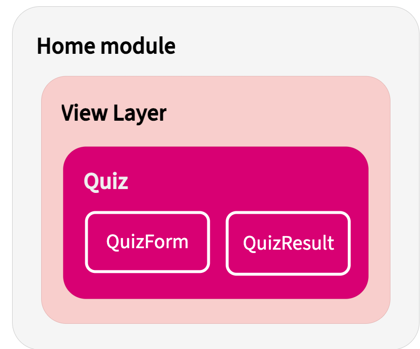
Here’s a schema to reinforce how widgets are structured in the Home module:
Because widgets are regular React components, they can contain other widgets. Of course, for better performance and maintainability, it’s better to keep nesting shallow.
Folders organization
This is how your folder structure should look when you finish creating the view layer of the Home module:
src
├── modules
│   ├── History
│   └── Home
│       ├── data
│       ├── model
│       └── view
│           ├── Quiz.tsx
│           ├── QuizForm.tsx
│           ├── QuizResult.tsx
│           ├── index.ts - index file for re-exporting
├── routes
│   ├── __root.tsx
│   └── index.tsx
Previewing the Quiz
Now we can see the Quiz widget by displaying it on the main route. Open src/routes/index.tsx and write the next code:
import { Quiz } from "@/modules/Home/view";
import { createFileRoute } from "@tanstack/react-router";

export const Route = createFileRoute("/")({
  component: Home,
});

// Temporar orchestrating component
function Home() {
  const mockField = {
    state: {
      value: "",
      meta: {
        isValid: true,
        errors: [],
      },
    },
    handleChange: () => {},
  };

  const mockForm = {
    Field: ({ children }: any) => children(mockField),
  } as any;

  const mockProps = {
    country: { flag: "https://flagcdn.com/w320/cn.png", name: "China" },
    form: mockForm,
    result: undefined,
    onSubmit: () => {},
  };

  return <Quiz {...mockProps} />;
}
This isn’t the correct way of doing such things, because:
We should not mix Orchestrator’s code with the route’s code.
Mocking is, obviously, only for testing.
We’ll fix everything step-by-step in the next articles by implementing a real form and submission handling. Also, we’ll randomly pick a country to guess and display the result.
Depending on the properties you provided, you must see the next outcomes:
Start of the quiz:
User entered correct answer:
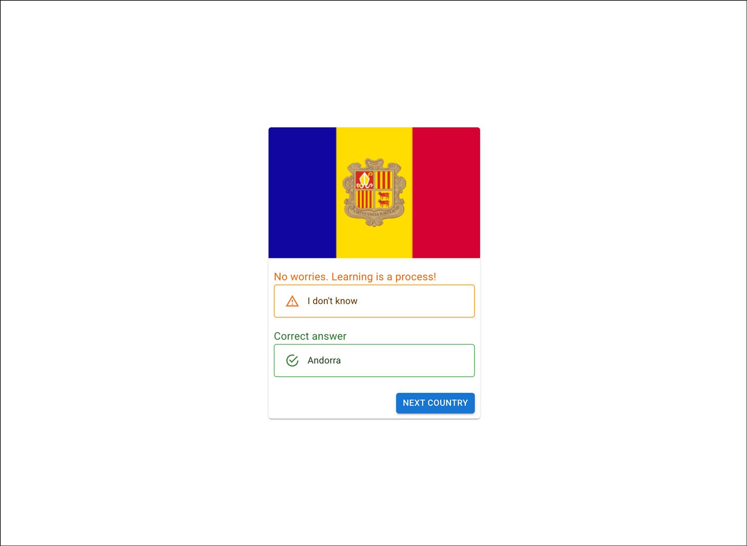
User entered the wrong answer:
Testing
NOTE: I’m using Vitest and React Testing Library to write unit tests.
Test start of the quiz
First, let’s test the Quiz widget:
// src/modules/Home/view/tests/Quiz.test.tsx

import { render, screen } from "@testing-library/react";
import { describe, it, expect, vi, beforeEach, afterEach } from "vitest";
import { Quiz } from "../Quiz";
import type { QuizProps } from "../../model";

// Mock Material-UI components to avoid testing library complications
vi.mock("@mui/material", () => ({
  Button: ({ children, onClick, ...props }: any) => (
    <button onClick={onClick} {...props}>
      {children}
    </button>
  ),
  Card: ({ children }: any) => <div>{children}</div>,
  CardActions: ({ children }: any) => <div>{children}</div>,
  CardContent: ({ children }: any) => <div>{children}</div>,
  CardMedia: ({ title, image }: any) => <img alt={title} src={image} />,
}));

// Mock child components
vi.mock("../QuizForm", () => ({
  QuizForm: ({ form }: any) => (
    <div data-testid="quiz-form">
      QuizForm Component - Form State: {JSON.stringify(form)}
    </div>
  ),
}));

vi.mock("../QuizResult", () => ({
  QuizResult: ({ result }: any) => (
    <div data-testid="quiz-result">
      QuizResult Component - Result: {JSON.stringify(result)}
    </div>
  ),
}));

describe("Quiz", () => {
  const mockOnSubmit = vi.fn();

  const mockCountry = {
    flag: "https://example.com/flag.png",
    name: "TestCountry",
  };

  const mockForm = {
    Field: ({ children }: any) =>
      children({ state: { value: "", meta: { isValid: true, errors: [] } } }),
    handleSubmit: vi.fn(),
    resetField: vi.fn(),
  } as any;

  const mockResult = {
    flagImage: "https://example.com/flag.png",
    countryName: "TestCountry",
    userAnswer: "TestAnswer",
  };

  beforeEach(() => {
    vi.clearAllMocks();
  });

  afterEach(() => {
    vi.restoreAllMocks();
  });

  it("should render quiz form when no result is provided", () => {
    const props: QuizProps = {
      country: mockCountry,
      form: mockForm,
      result: undefined,
      onSubmit: mockOnSubmit,
    };

    render(<Quiz {...props} />);

    expect(screen.getByTestId("quiz-form")).toBeDefined();
    expect(screen.queryByTestId("quiz-result")).toBeNull();
    expect(screen.getByText("Submit answer")).toBeDefined();
  });

  it("should render quiz result when result is provided", () => {
    const props: QuizProps = {
      country: mockCountry,
      form: mockForm,
      result: mockResult,
      onSubmit: mockOnSubmit,
    };

    render(<Quiz {...props} />);

    expect(screen.getByTestId("quiz-result")).toBeDefined();
    expect(screen.queryByTestId("quiz-form")).toBeNull();
    expect(screen.getByText("Next country")).toBeDefined();
  });

// Find other test cases here: https://github.com/ole-techwood/articles/blob/mvvm/src/modules/Home/view/tests/Quiz.test.tsx
});
Pay attention to how easy it is to test the widget when we don’t have any business logic inside. All we have to mock is the underlying components:
// Mock Material-UI components to avoid testing library complications
vi.mock("@mui/material", () => ({
  Button: ({ children, onClick, ...props }: any) => (
    <button onClick={onClick} {...props}>
      {children}
    </button>
  ),
  Card: ({ children }: any) => <div>{children}</div>,
  CardActions: ({ children }: any) => <div>{children}</div>,
  CardContent: ({ children }: any) => <div>{children}</div>,
  CardMedia: ({ title, image }: any) => <img alt={title} src={image} />,
}));

// Mock child components
vi.mock("../QuizForm", () => ({
  QuizForm: ({ form }: any) => (
    <div data-testid="quiz-form">
      QuizForm Component - Form State: {JSON.stringify(form)}
    </div>
  ),
}));

vi.mock("../QuizResult", () => ({
  QuizResult: ({ result }: any) => (
    <div data-testid="quiz-result">
      QuizResult Component - Result: {JSON.stringify(result)}
    </div>
  ),
}));
We control the widget’s behavior in tests by passing different props. No need to mock hooks or data fetching logic:
it("should render quiz form when no result is provided", () => {
  const props: QuizProps = {
    country: mockCountry,
    form: mockForm,
    result: undefined,
    onSubmit: mockOnSubmit,
  };

  render(<Quiz {...props} />);

  expect(screen.getByTestId("quiz-form")).toBeDefined();
  expect(screen.queryByTestId("quiz-result")).toBeNull();
  expect(screen.getByText("Submit answer")).toBeDefined();
});

it("should render quiz result when result is provided", () => {
  const props: QuizProps = {
    country: mockCountry,
    form: mockForm,
    result: mockResult,
    onSubmit: mockOnSubmit,
  };

  render(<Quiz {...props} />);

  expect(screen.getByTestId("quiz-result")).toBeDefined();
  expect(screen.queryByTestId("quiz-form")).toBeNull();
  expect(screen.getByText("Next country")).toBeDefined();
});
Test the answering form
This is how we can test QuizForm:
// src/modules/Home/view/tests/QuizForm.test.tsx

import { render, screen } from "@testing-library/react";
import { describe, it, expect, vi, beforeEach, afterEach } from "vitest";
import { QuizForm } from "../QuizForm";
import type { QuizFormProps } from "../../model";

// Mock Material-UI components
vi.mock("@mui/material", () => ({
  TextField: ({ label, value, onChange, error, helperText, ...props }: any) => (
    <div>
      <label htmlFor="answer-input">{label}</label>
      <input
        id="answer-input"
        value={value}
        onChange={onChange}
        data-error={error}
        {...props}
      />
      {helperText && <span data-testid="helper-text">{helperText}</span>}
    </div>
  ),
}));

describe("QuizForm", () => {
  const mockHandleChange = vi.fn();

  const mockField = {
    state: {
      value: "",
      meta: {
        isValid: true,
        errors: [],
      },
    },
    handleChange: mockHandleChange,
  };

  const mockForm = {
    Field: ({ children }: any) => children(mockField),
  } as any;

  beforeEach(() => {
    vi.clearAllMocks();
  });

  afterEach(() => {
    vi.restoreAllMocks();
  });

  it("should render form with text input field", () => {
    const props: QuizFormProps = { form: mockForm };

    render(<QuizForm {...props} />);

    expect(screen.getByLabelText("Your answer")).toBeDefined();
    expect(screen.getByRole("textbox")).toBeDefined();
  });

// Find other test cases here: https://github.com/ole-techwood/articles/blob/mvvm/src/modules/Home/view/tests/QuizForm.test.tsx
});
Again, dead simple, we mock the MUI’s TextField component and then check different conditions by passing different values in the form prop.
Test results
Last but not least - QuizResult tests:
import { render, screen } from "@testing-library/react";
import { describe, it, expect, vi, beforeEach, afterEach } from "vitest";
import { QuizResult } from "../QuizResult";
import type { QuizResultProps } from "../../model";

// Mock Material-UI components
vi.mock("@mui/material", () => ({
  Stack: ({ children }: any) => <div data-testid="stack">{children}</div>,
  Typography: ({ children, color, ...props }: any) => (
    <p data-color={color} {...props}>
      {children}
    </p>
  ),
  Alert: ({ children, severity, variant }: any) => (
    <div data-testid="alert" data-severity={severity} data-variant={variant}>
      {children}
    </div>
  ),
}));

describe("QuizResult", () => {
  const mockCorrectResult = {
    flagImage: "https://example.com/flag.png",
    countryName: "France",
    userAnswer: "france",
  };

  beforeEach(() => {
    vi.clearAllMocks();
  });

  afterEach(() => {
    vi.restoreAllMocks();
  });

  it("should render success message for correct answer", () => {
    const props: QuizResultProps = { result: mockCorrectResult };

    render(<QuizResult {...props} />);

    expect(screen.getByText("Brilliant work!")).toBeDefined();
    expect(screen.getByText("France")).toBeDefined();

    const successAlert = screen.getByTestId("alert");
    expect(successAlert.getAttribute("data-severity")).toBe("success");
  });

  // Find other test cases here: https://github.com/ole-techwood/articles/blob/mvvm/src/modules/Home/view/tests/QuizResult.test.tsx
});
The testing approach is the same as with the previous two widgets; nothing new here.
And that’s it, we’re done with tests! Now, when you saw the whole process of creating a view layer with widgets, I want to give you a little homework.
Study by practicing
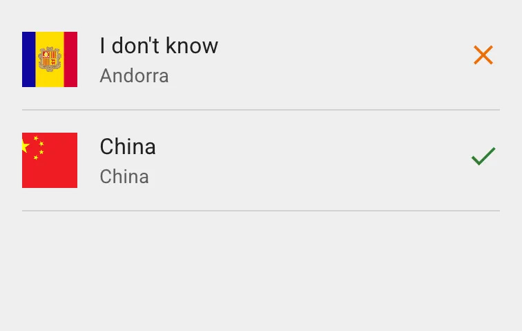
Don’t just grind tutorials. Better implement the new knowledge, practicing right off the bat! That’s why I want you to create a HistoryList widget within the History module of the app.
Requirements:
It must be a clean React component with a single
historyproperty of theHistoryRecord[]type (we created the type in the model layer article).It must iterate through the
historyarray and list all the answers.It must be integrated into the left sidebar of the layout we created earlier in the article.
Add some tests for it.
Final result should look kinda like this:
Good luck! Keep in mind, you can always find the ready variant in the source code. But really, do your best and complete the task on your own (remember, AI is your friend, not an enemy! 🙂).
Conclusion
This is it, folks! ✅
Today, we’ve discussed the view layer. In a nutshell, this is the layer our users see and interact with. So it’s essential to keep the layer and its parts clean, maintainable, and covered in tests.
Not just by reading, but by doing you:
Learned what the widget is in MVVM architecture.
Got to know how to create a layout for the whole app in TanStack Router.
Understood how to create and test the widget.
By this time, you have all the knowledge to create robust view layers utilizing MVVM architecture in production-grade systems!
What’s next?
Continue reading the next articles in the MVVM series:
Or go over the previous ones:
Creating content like this is not an easy ride, so I hope you’ll hit that like button and drop a comment. As usual, constructive feedback is always welcome!
📰 Read me on the platform of your choice: Substack, DEV.to
See ya soon 👋


